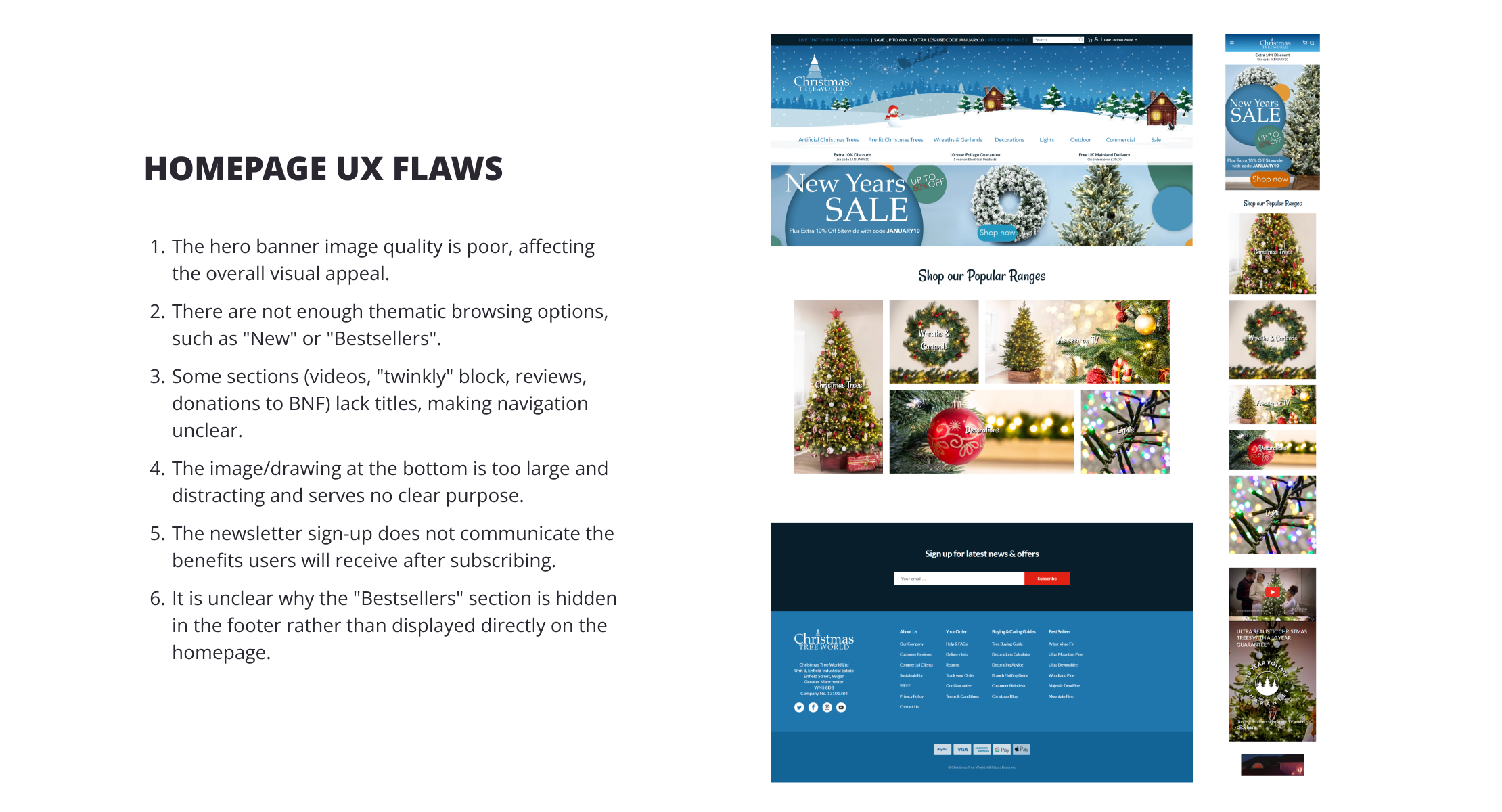
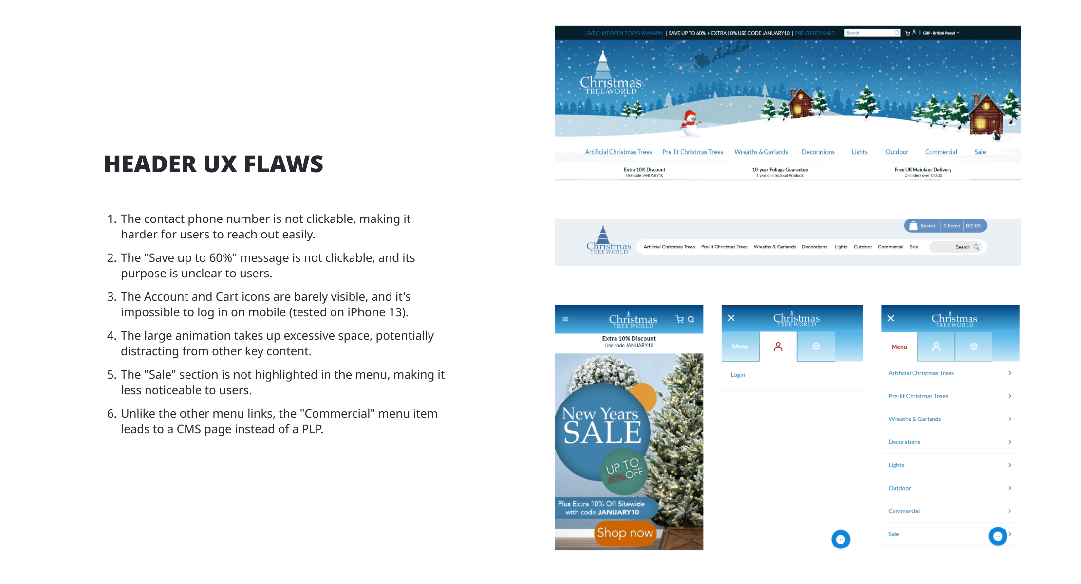
Case Study

Bringing Christmas Cheer to B2C and B2B: A HYVÄ-Based Journey Redesign

Mobile-first approach
Joyful, Christmas-inspired designs
Hyva theme implementation
B2B specifics integration

Project introduction

ABOUT THE CLIENT

Christmas Tree World is a family-owned UK company providing stunning high-quality artificial Christmas trees and decorations for almost 40 years already.

PROJECT GOAL

The project objective was to move website to the Hyva theme and do redesign of homepage, product listing page, product details page, cart and checkout.
Focus on creating joyful Christmas-inspired designs
Highlight and simplify the B2B - oriented user journey
Mobile-friendly interface
Build brand awareness
User-centred UX with more personalization elements
Smooth cart and checkout UX

Approach

STEP 1

UX EXPERT REVIEW

For this project, UX gap identification and recommendations based on eCommerce best practices were streamlined by compiling them into a single FigJam file. Additionally, the potential to reuse default Hyva theme blocks was utilized to simplify and accelerate development.
STEP 1

UX EXPERT REVIEW

For this project, UX gap identification and recommendations based on eCommerce best practices were streamlined by compiling them into a single FigJam file. Additionally, the potential to reuse default Hyva theme blocks was utilized to simplify and accelerate development.
STEP 2

UX WORKSHOP

After the UX expert completed the review, a collaborative workshop was held with the client to align on the approach for each page layout. This process led to the creation of functional blocks that served as the foundation for the design.
STEP 2

UX WORKSHOP

After the UX expert completed the review, a collaborative workshop was held with the client to align on the approach for each page layout. This process led to the creation of functional blocks that served as the foundation for the design.
STEP 3

WIREFRAMING PHASE

After finalizing the functional blocks and agreeing on the overall approach, we proceeded to create high-fidelity wireframes for each page. These wireframes were designed to cater to both desktop and mobile formats, ensuring consistency and usability across different devices.
Key categories are displayed for easy access to ensure users are aware of the wide assortment offered. Especially useful on mobile, where the main categories are hidden under the hamburger menu.
Highlighted “Sales” section to catch user attention and give the deal-cautious user personas a reason to explore the site more.
For better visibility, the option to switch from B2C to B2B is brought up at the very top of the header.
Clickable Google review link as one of the USPs to provide social proof and easy access to read about the company and its services.
Prominent, full-width hero banner that puts more focus on bold messaging, clear path to category pages, and big imagery.
Incorporation of a live chat feature in the bottom corner to enhance user engagement and provide immediate assistance, addressing customer inquiries in real-time.
See 5 more improvements
See less
Breadcrumbs, category titles, and short descriptions are added to improve website navigation, particularly for users arriving via search engines.
Quick filters, matching the badges on product cards, enable users to narrow down their product search more efficiently.
Focus on big images to bring in more impressive visuals that evoke Christmas season vibes.
Quick access to subcategories to help users navigate better. Each category has an image to make it easier for users to visualize their needs.
See 3 more improvements
See less
Prominent product gallery to bring the main focus on the imagery.
Many trees come in different variants, such as "pre-lit," "half-tree," or "flocked," but these were previously not properly linked, causing customers to miss opportunities to explore additional upsell options.
Product key details displayed in a clean, easy-to-scan format.
Product details such as description, tech specs, delivery, returns, and guarantee information are available upfront right under the first fold.
See 3 more improvements
See less
STEP 3

WIREFRAMING PHASE

After finalizing the functional blocks and agreeing on the overall approach, we proceeded to create high-fidelity wireframes for each page. These wireframes were designed to cater to both desktop and mobile formats, ensuring consistency and usability across different devices.
STEP 4

STYLE & DESIGNS

Once the high-fidelity wireframes were completed and approved, and the page layout and user journey flow were finalized, we transitioned to the design phase. During this stage, we developed a completely new visual identity for the Christmas Tree World website.
STEP 4

STYLE & DESIGNS

Once the high-fidelity wireframes were completed and approved, and the page layout and user journey flow were finalized, we transitioned to the design phase. During this stage, we developed a completely new visual identity for the Christmas Tree World website.

HOMEPAGE REDESIGN

The objective for the Christmas Tree World homepage was to create a visually appealing and streamlined design while driving conversions.
By showcasing unique selling points and featuring customer reviews and photos on the front page, we aimed to build trust with new customers who may not yet recognize the exceptional quality of CTW's decorations. Additionally, prominent links to category pages and highlighted products ensured that customers were well-informed about the extensive product range.

Build trust and credibility

Customer ratings and testimonials play a vital role on the Christmas Tree World homepage. The overall website rating is displayed in the header, while each product features a star rating on its card. Additionally, the customer reviews and showcase competition blocks further reinforce credibility and trust in the brand.

List all main categories

By showcasing the most popular product categories on the homepage, users can quickly understand the product assortment and easily access their category of interest without relying on the main navigation or search. This is especially important on mobile devices, where the main navigation is hidden behind a hamburger menu.
Mobile
Desktop

Highlight great service

The "We’re Here to Help!" block provides users with quick access to delivery information, returns details, and a direct link to the helpdesk. Including this block on the homepage enhances user experience by offering easy, immediate access to important customer support resources, reducing friction and increasing user satisfaction.

CHECK THE RESULT FOR YOURSELF!

Before
After

PRODUCT DETAIL PAGE REDESIGN

The product detail page underwent the most significant revamp, requiring the most work.
The goal was to improve the UX by reorganizing the content to make it clearer, more appealing, and engaging. The design features high-quality imagery and a clean layout, encouraging users to explore the page further.

Focus on the imagery and key details

The first fold of the product detail page prominently displays the product image, overlaid with key details such as the title, price, rating, "Add to Cart" button, and alternative product suggestions. Many trees come in different variants, such as "pre-lit," "half-tree," or "flocked," but these were previously not properly linked, causing customers to miss opportunities to explore additional upsell options.

Enhance visibility of key product features

Continuing the trend of making designs more visual and detail-oriented, a block that displays key product features in an icon, title, and description format complements this approach perfectly. By doing so, more users can find the product specifics they are looking for in less time.

Evoke emotion with customer image gallery

A block featuring customer photos of the product helps create a festive "Christmas vibe" by showcasing real-life images in holiday settings, allowing users to visualize the product in their own homes. It also acts as social proof, building trust and credibility by showing that other customers are satisfied with their purchase, ultimately boosting conversion rates.
Mobile
Desktop

Make bundle creation fun!

Prebuilt customizable bundles for buying a Christmas tree simplify the purchasing process by providing a convenient, curated selection of related items—such as lights, decorations, and tree stands—that complement the tree. This saves users time and effort in searching for compatible accessories.

Additionally, offering customization allows users to tailor the bundle to their specific preferences, ensuring they get exactly what they need.

Provide help

A "Help Center" block is introduced on the PDP, featuring links to aftercare resources, instructional manuals, and videos to further assist users. By offering this support directly on the product page, users can feel more confident about their purchase decision, knowing that help is readily available.

CHECK THE RESULT FOR YOURSELF!

First fold
Before
After

CHECKOUT REDESIGN

A seamless checkout experience is essential for driving sales and building customer loyalty.
Switching to an accordion checkout was a strategic decision to create a more streamlined and user-friendly experience. Guiding users step by step reduces clutter, minimizes distractions, and lowers the likelihood of errors.

Streamline the checkout process

Accordion checkout layout displays only one step at a time, reducing visual clutter and making the process  more manageable.

Improve focus

Guides users step by step, minimizing distractions and potential errors.

Mobile-optimized

Accordion checkout saves screen space, making it ideal for smaller devices.
Mobile
Desktop

Enhance usability

Allows users to review or edit previous steps without restarting the checkout process.

Split delivery for mixed cart

Some products are available when “pre-order” items are in one cart with in-stock items. Customers can choose split delivery to receive in-stock items faster than pre-order items. Additionally, offering customization allows users to tailor the bundle to their specific preferences, ensuring they get exactly what they need.

REDESIGN SUMMARY

Conversion-driven design across key page templates

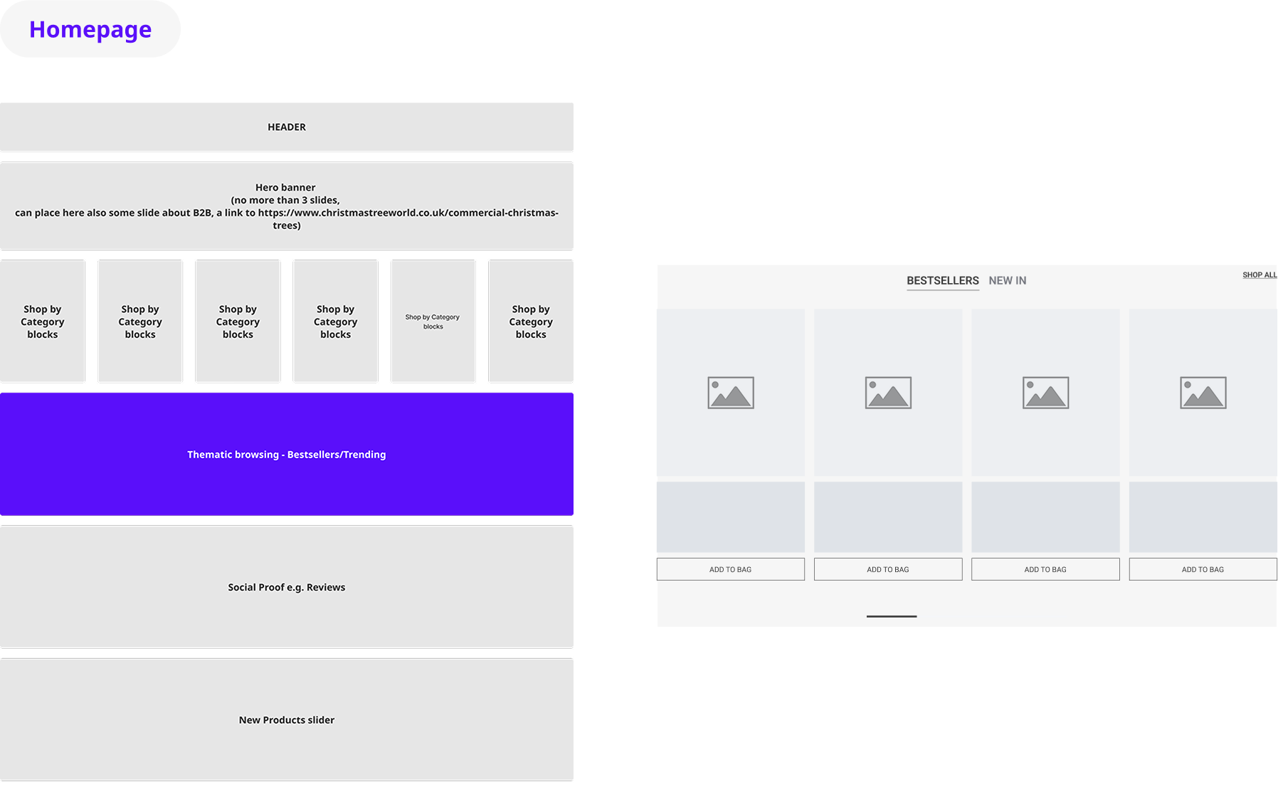
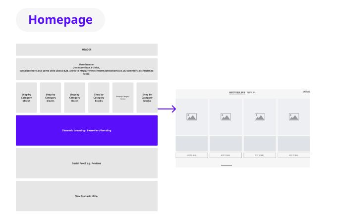
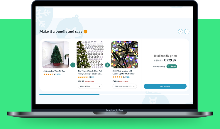
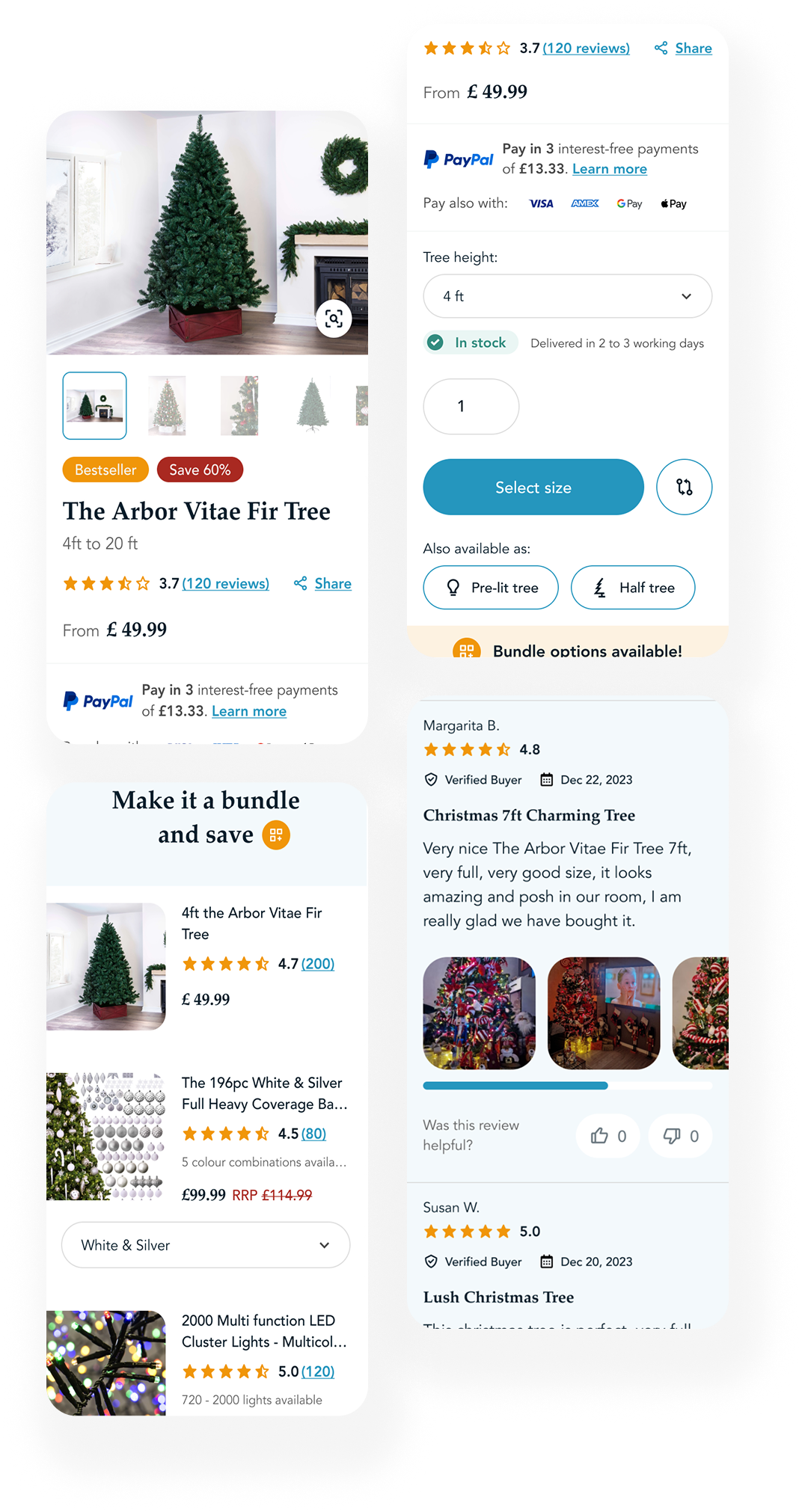
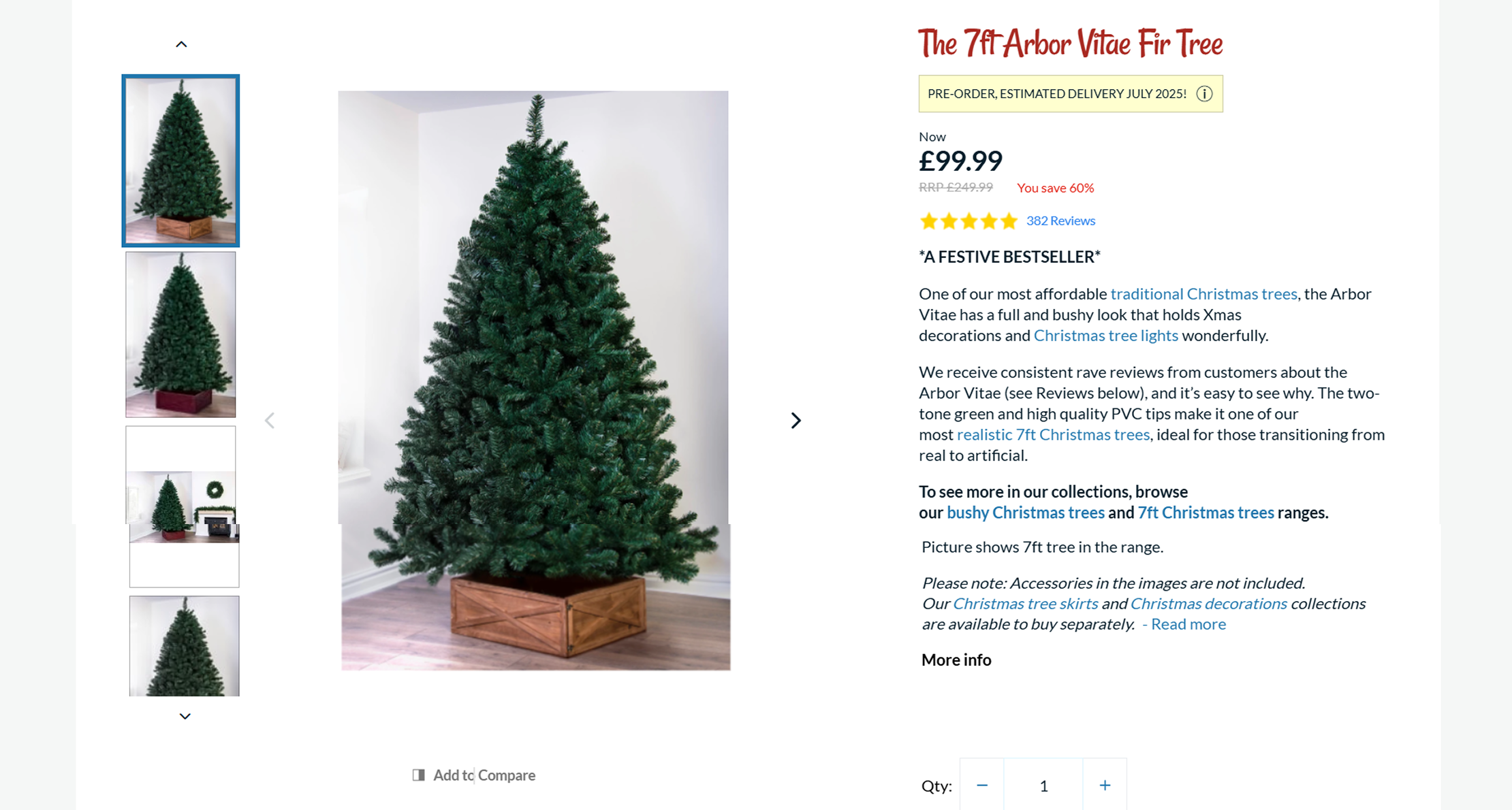
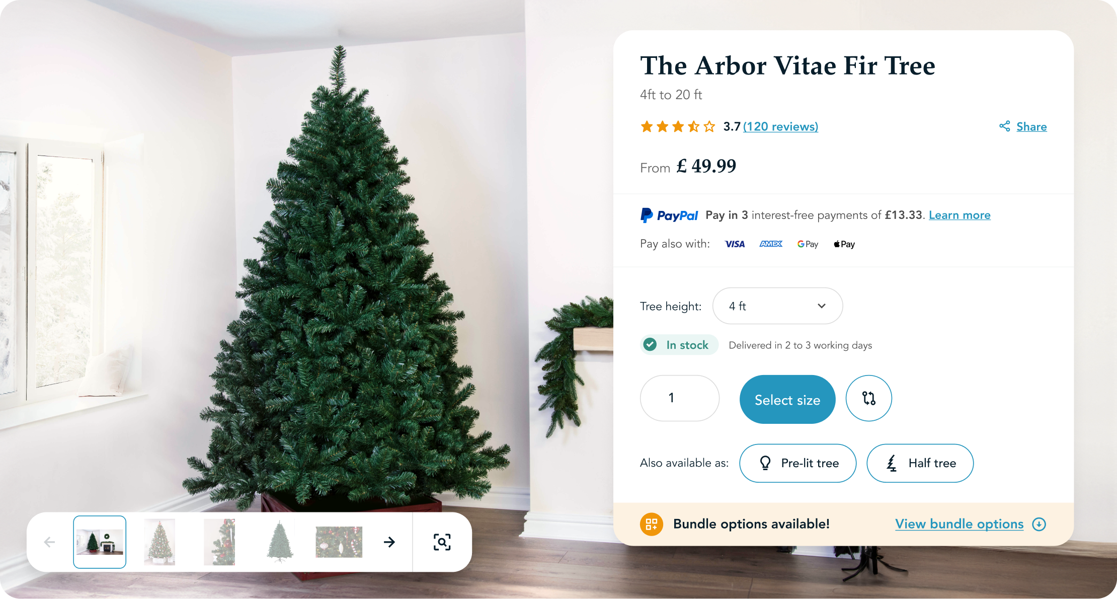
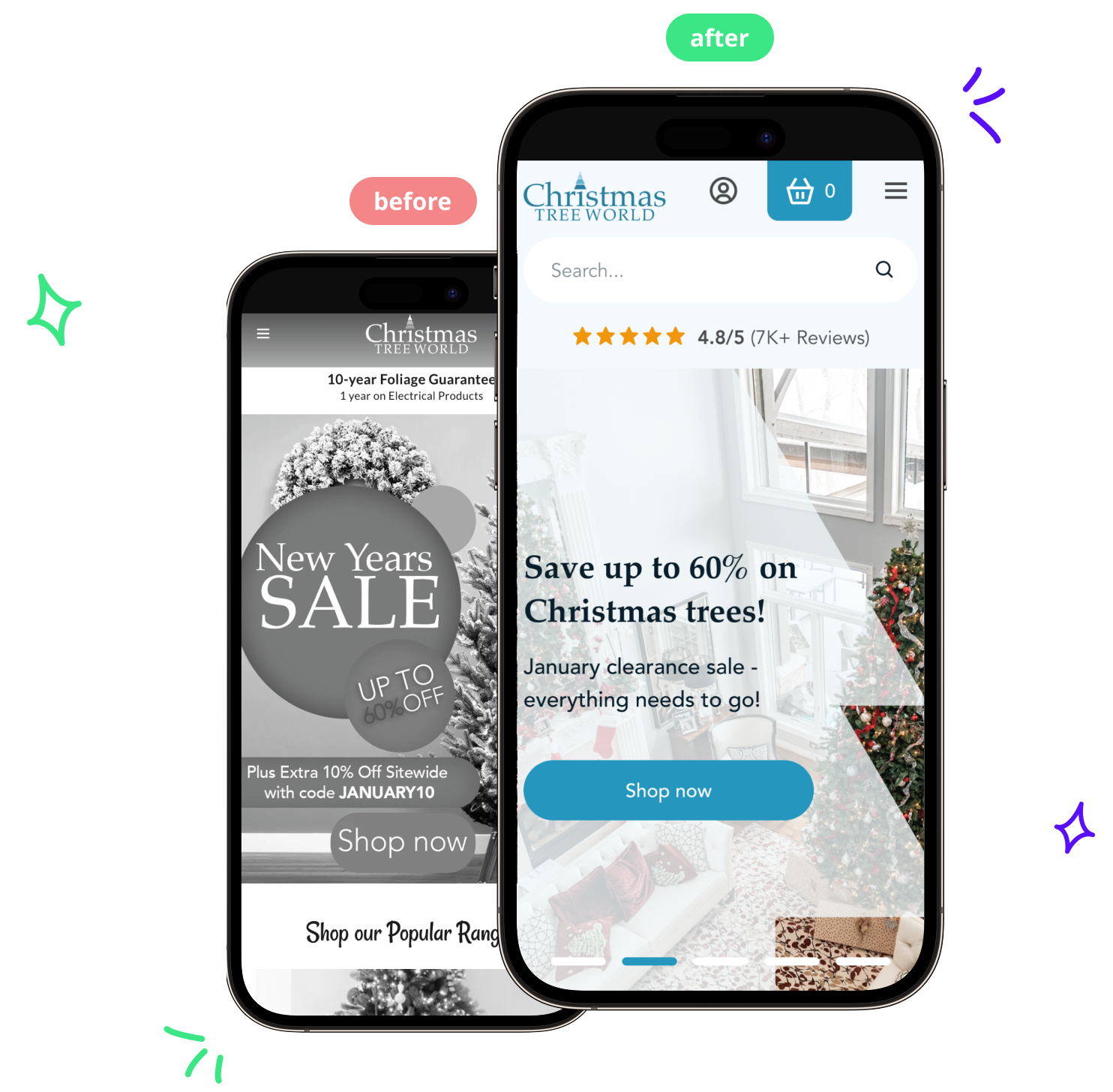
Redesigned essential pages like the homepage, product pages, and checkout to guide users smoothly through the shopping journey and boost sales.

Enhanced user experience with personalization & usability improvements

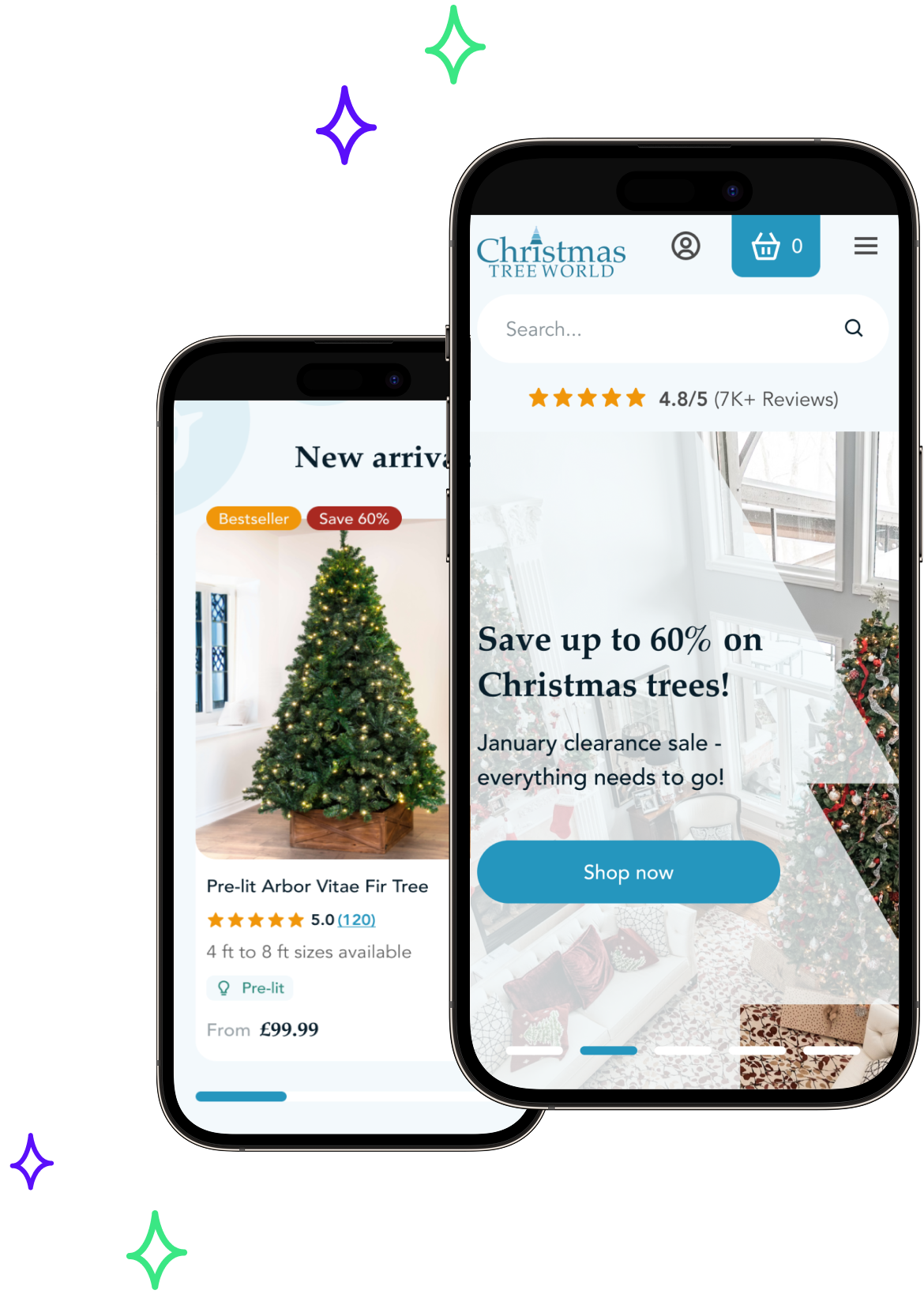
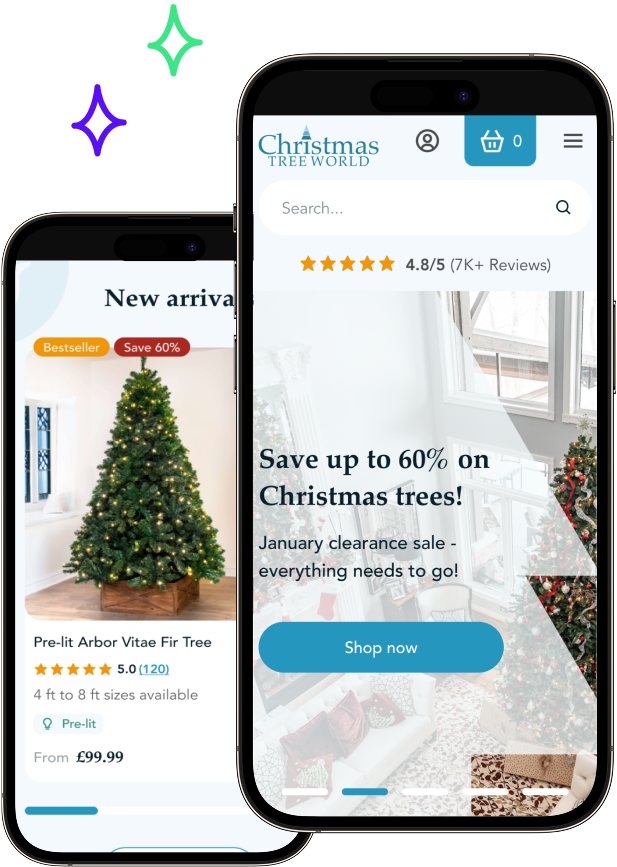
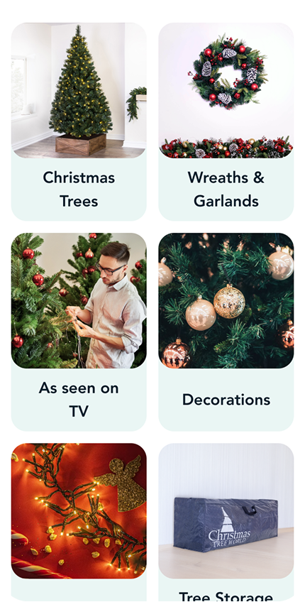
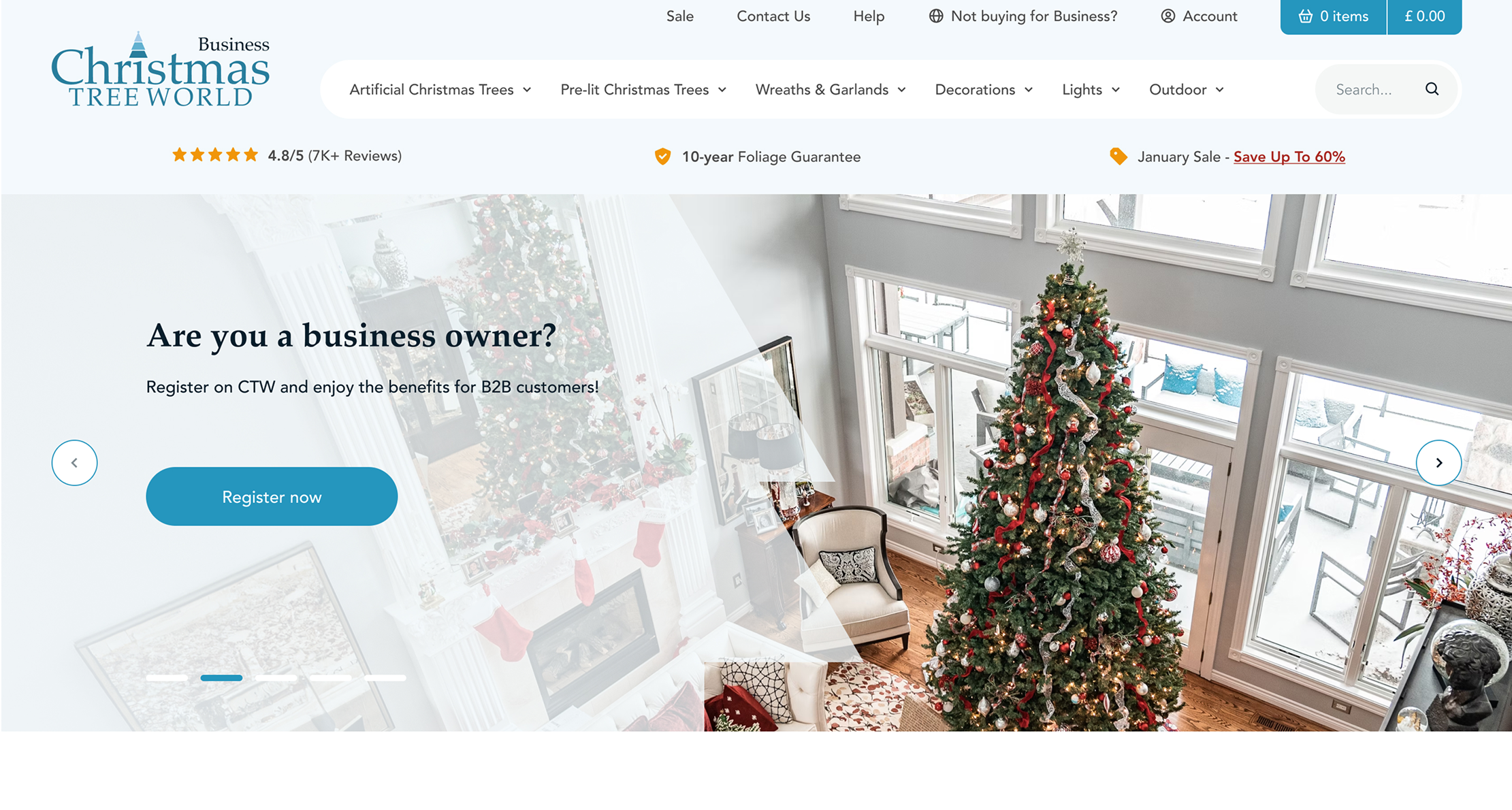
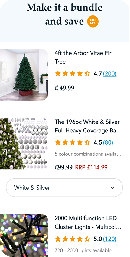
Implemented tailored recommendations and intuitive navigation to provide a more engaging and user-friendly experience.

Revamped look & feel with a Christmas-inspired design

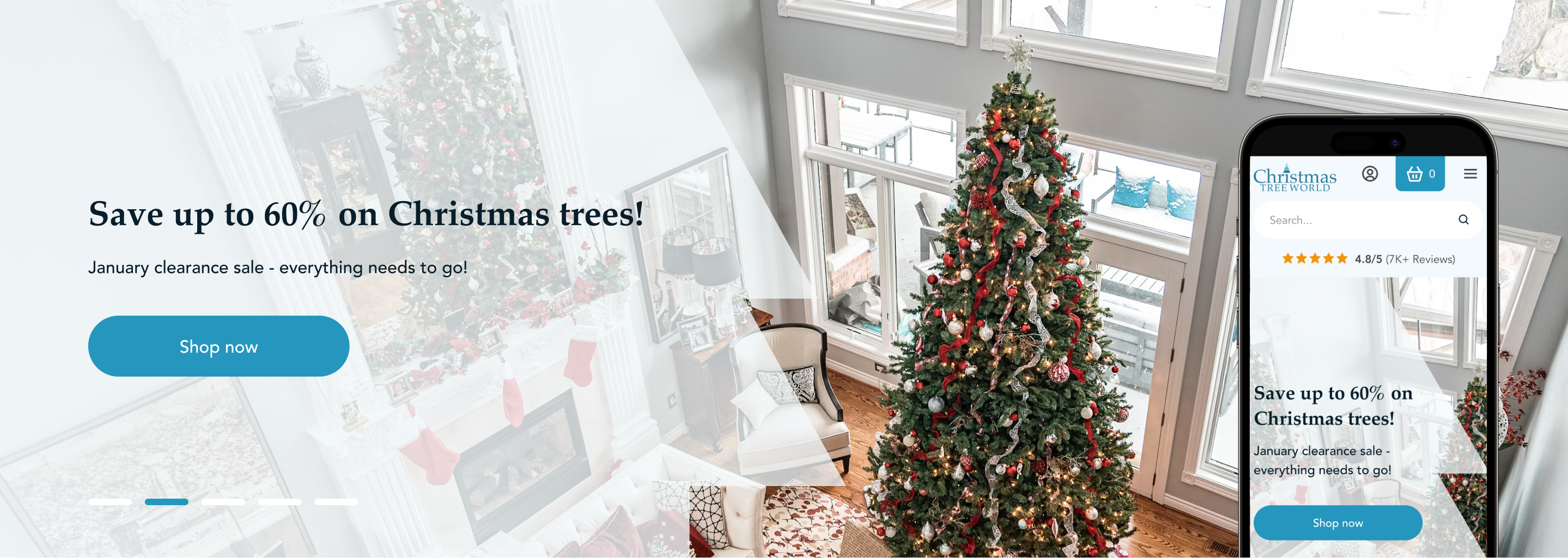
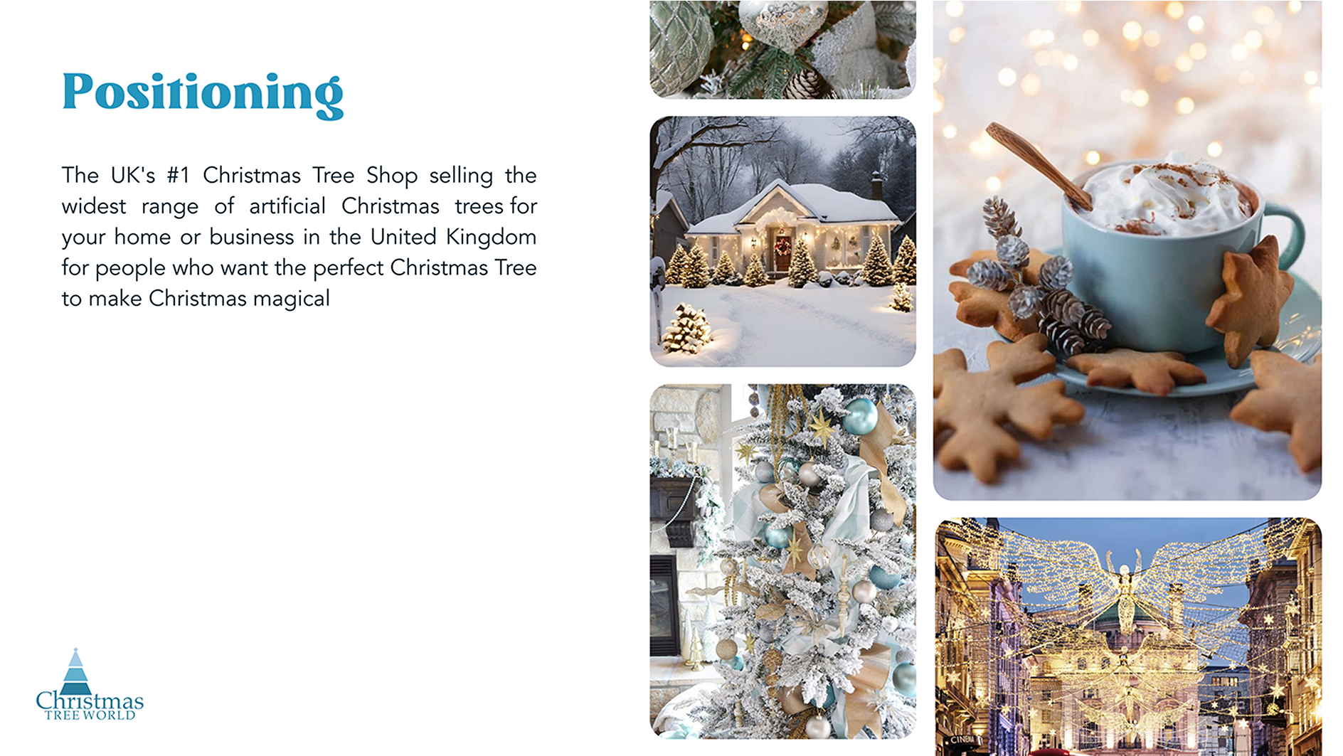
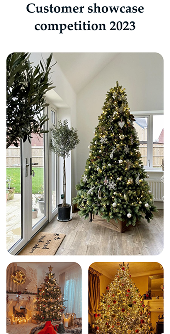
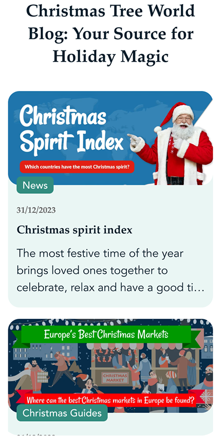
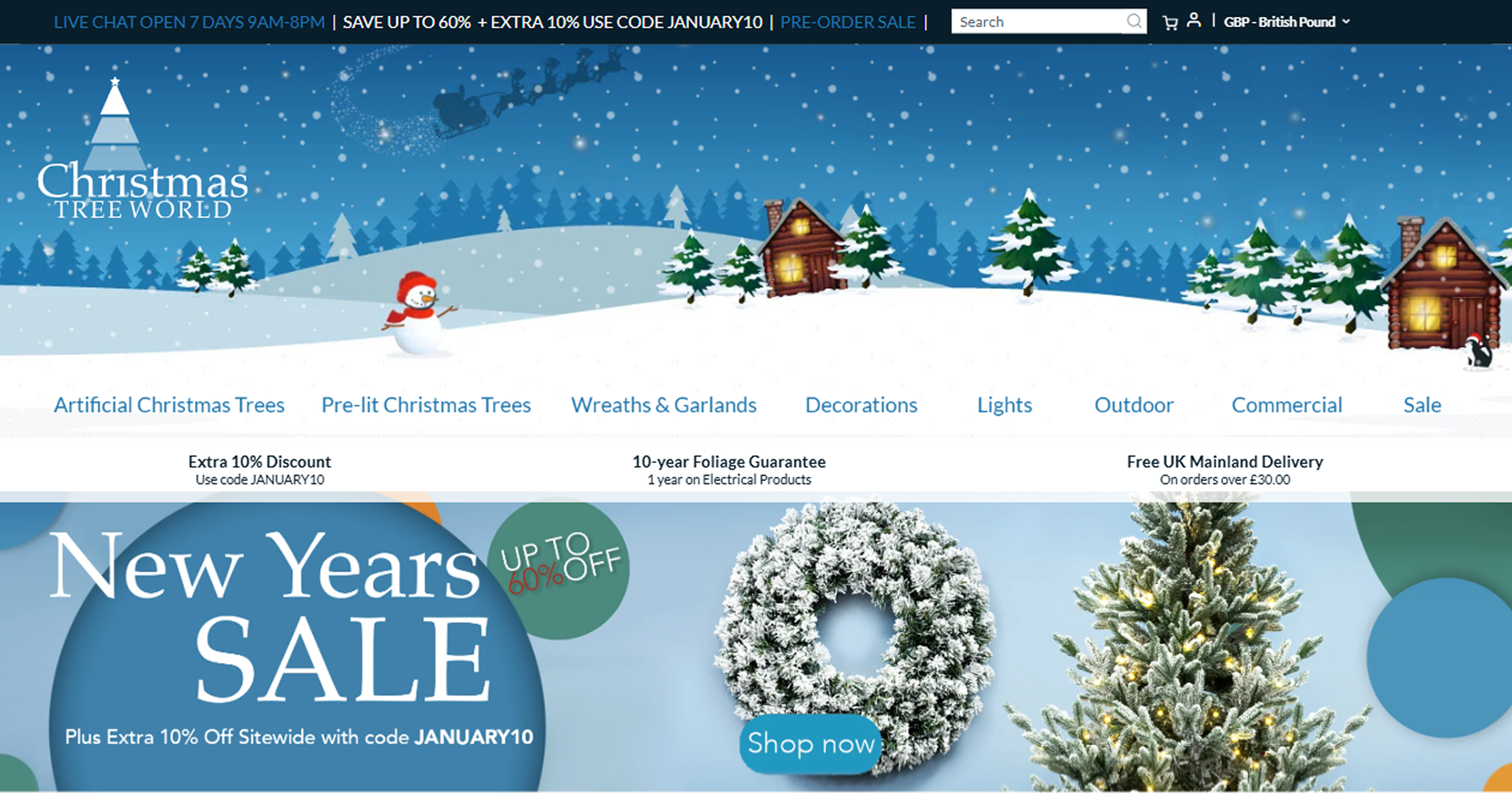
Introduced festive visuals and themed elements to create a joyful shopping atmosphere that resonates with the holiday season.

Optimized checkout flow for higher conversion rates

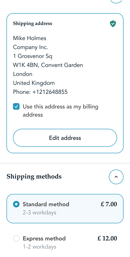
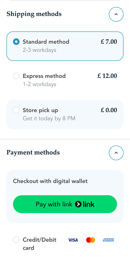
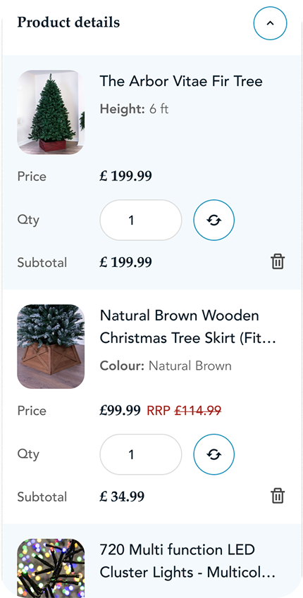
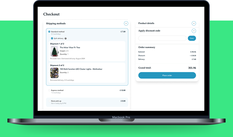
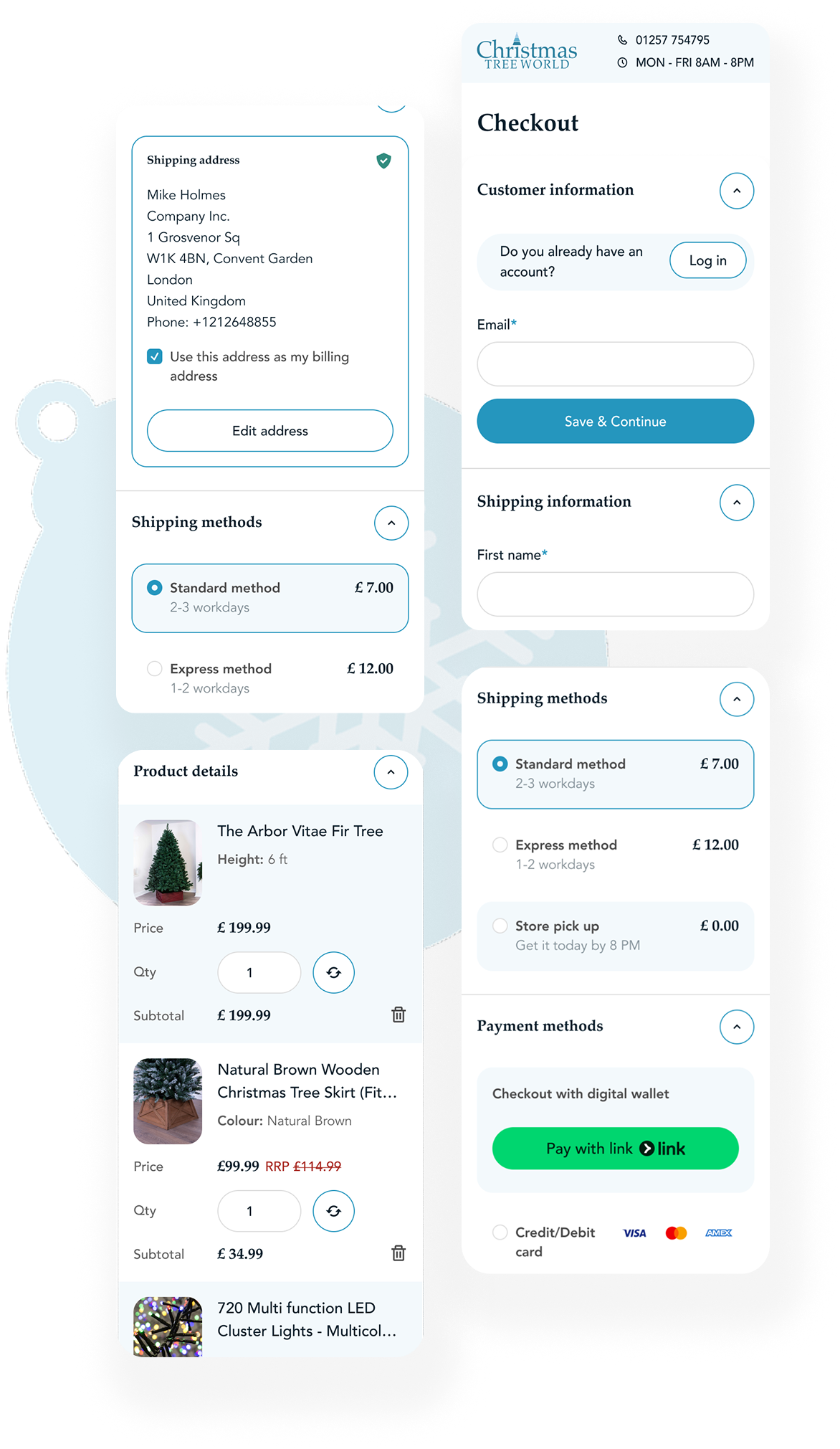
Streamlined the checkout process with an accordion layout, reducing steps and distractions to ensure a faster and hassle-free purchase.

Mobile-optimized shopping experience

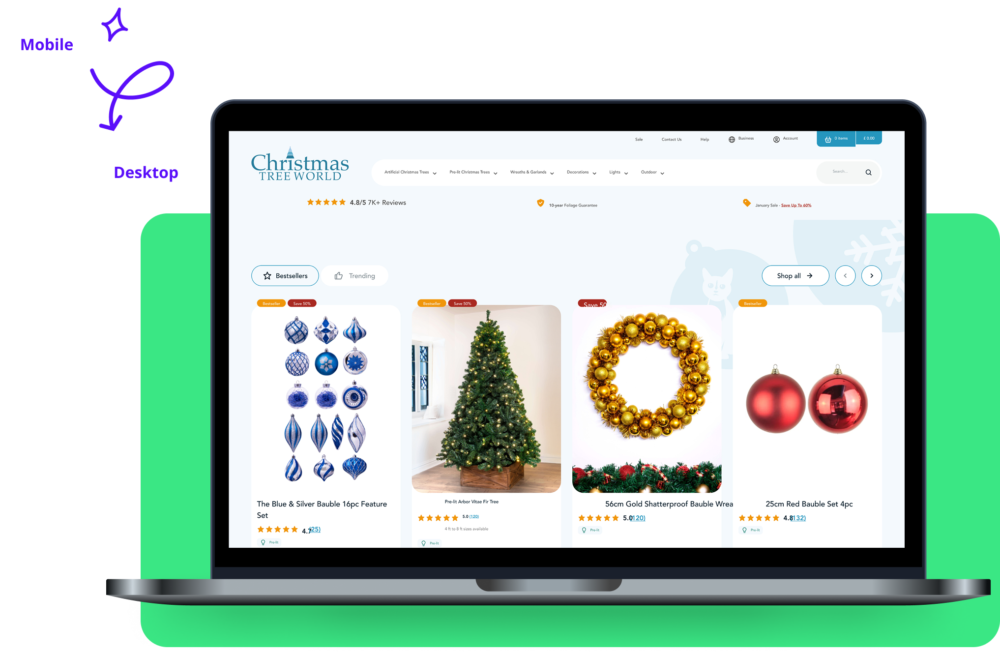
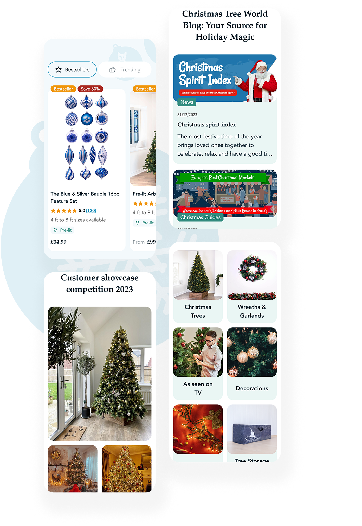
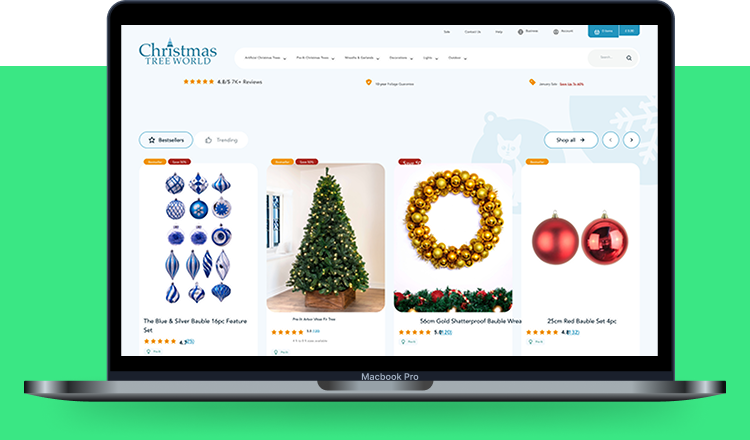
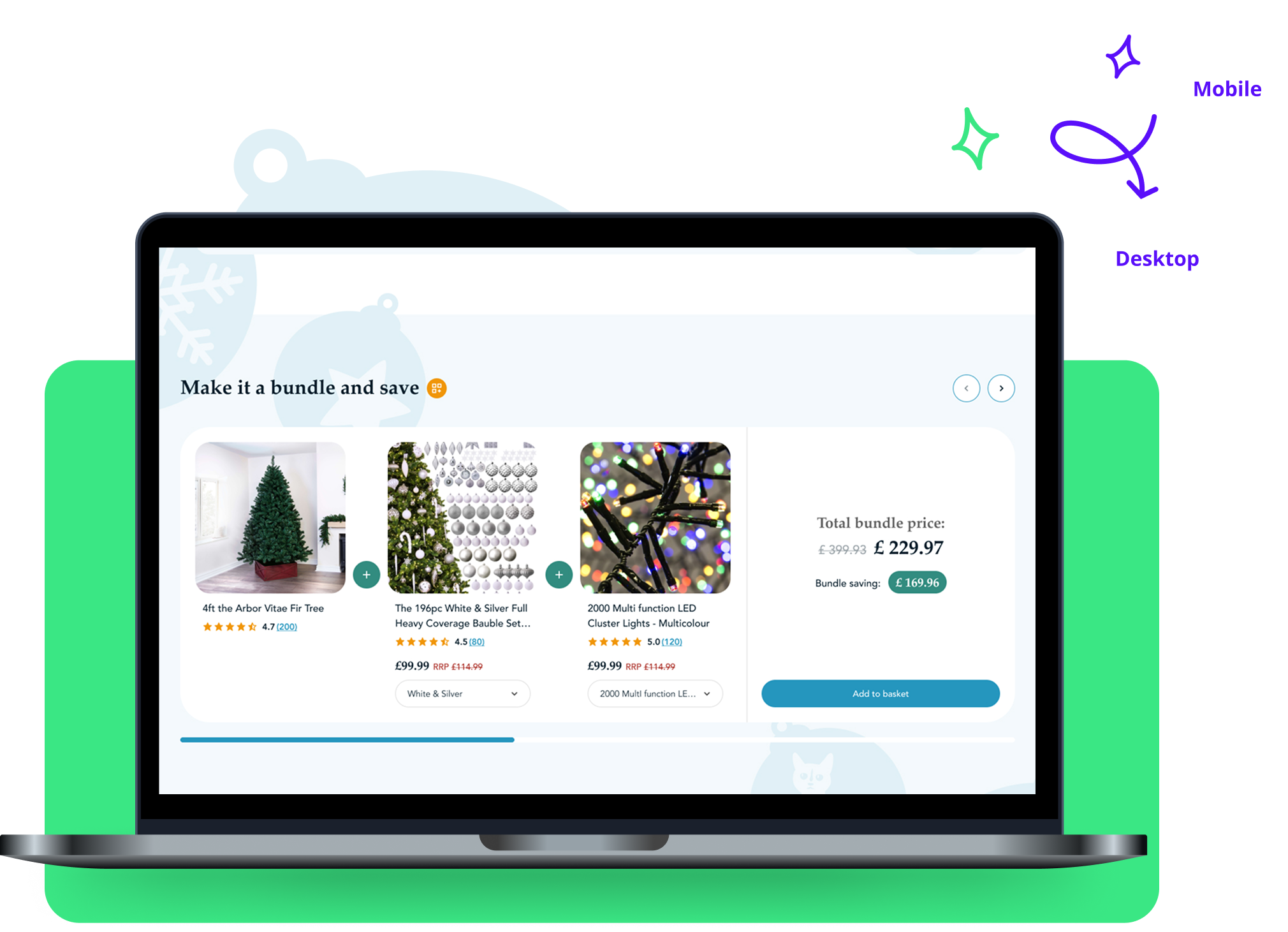
Ensured a responsive and user-friendly design across all devices, improving usability and accessibility for mobile shoppers.

Improved trust and credibility

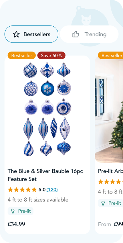
Incorporated customer reviews, ratings, and social proof to build confidence and encourage purchase decisions.
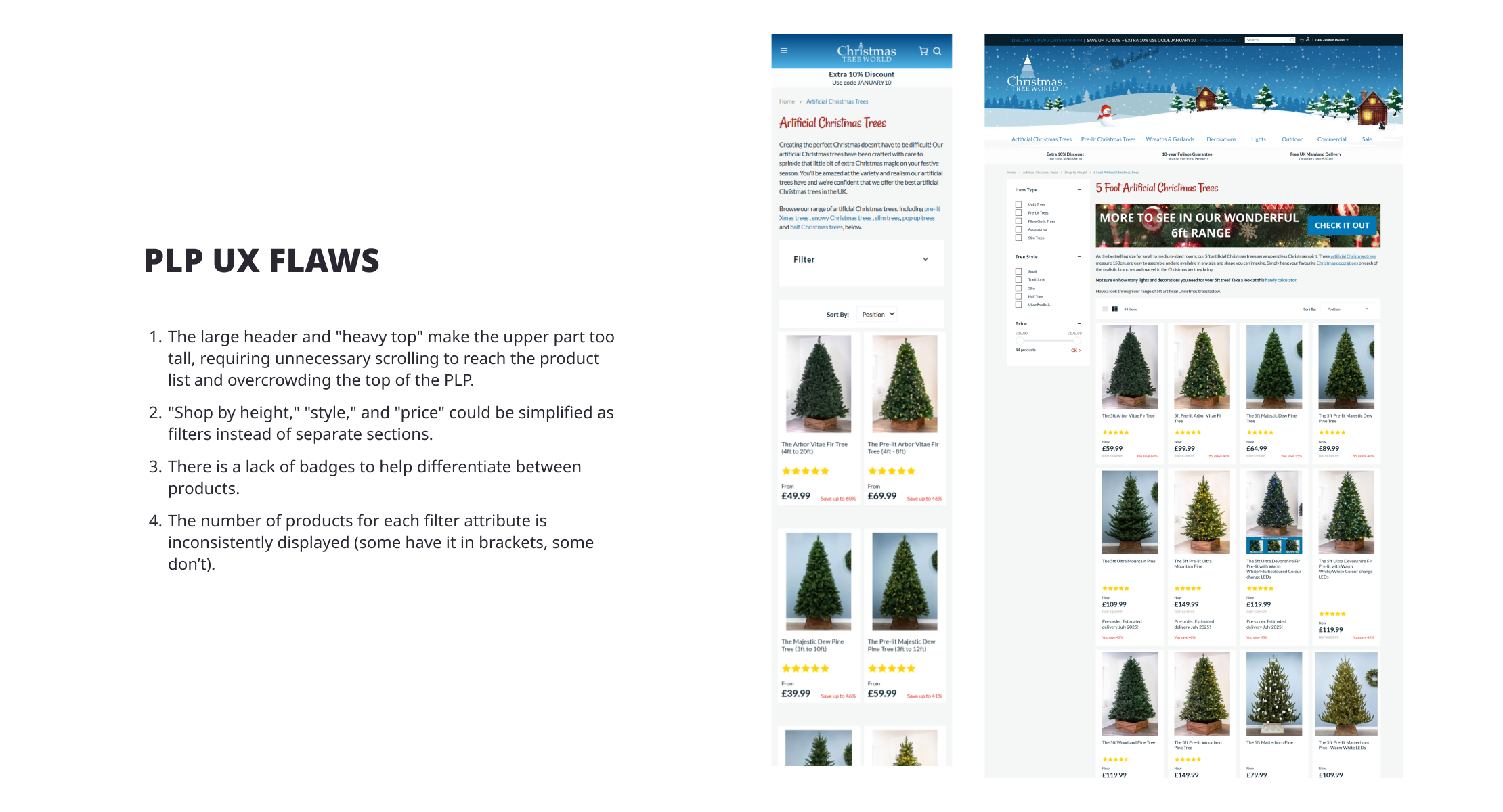
plan your next redesign
with our expert team!
Plan Your Next Redesign
with Our Expert Team!
How can we help you?*
Email*
First name*
Company website*
Start with a FREE consultation with our expert. No obligations.
If the matter cannot wait, schedule a call right away in Calendly, open a live chat or reach us at olga@conversion95.com
Thank you! Your submission has been received!
Oops! Something went wrong while submitting the form.

CREDITS

CREDITS

GET MONTHLY UX INSIGHTS TO YOUR MAILBOX

Learn more about our projects, reveal industry trends and discover how small details can enhance user experience and boost sales!

Send me my monthly UX newsletter
Thank you! Your submission has been received!
Oops! Something went wrong while submitting the form.